
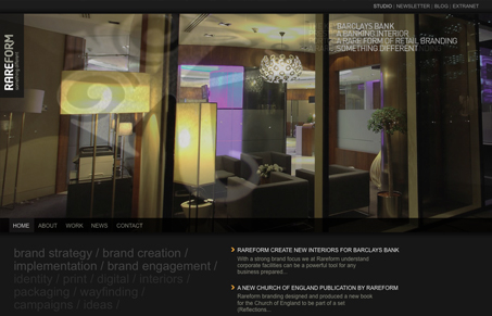
Nice ‘branding’ company website, good use of imagery/work and the typography is nice and tight. I’m not too hip on the sub pages, the horizontal scrolling of copy isn’t very effective, probably confusing to some users.


Fitts’s Law: Why the Easy Button Wins
Large, close targets are faster to hit than small, distant ones, that’s Fitts’s Law. A look at the 1954 rule behind buttons, prime and magic pixels, thumb zones, and dark patterns.


0 Comments