Submitted by Matt Bland, @ragged_edge.
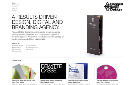
The latest website from the award-winning web and print agency Ragged Edge Design. Developed using CSS, HTML & Flash.
This is a great looking site design. I love the strong grid and minimal colors, the typography is also really tight. Two things stick out to me about this design, one is that it can get hard to read, the gray colored copy causes me to strain when I read it and two there doesn’t seem to be too much hierarchy as I scan down the pages.


Slick and beautifully designed. Great design work too
very slick and clean. I would like to see something a little different with the navigation. On the interior pages the sub navigation and the main navigation look too similar for my preference.
We’ve just relaunched this site with new work and an updated design. Alan will be pleased to hear we’ve redesigned the navigation too! Tweet us to let us know what you think: @ragged_edge