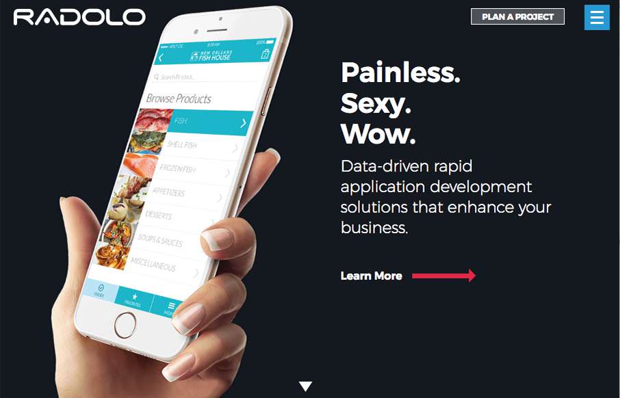
Pretty cool site design. I dig the bold graphic approach and the muted color palette. The project planner is cool as well as the fly-out menu design. Good work.
From the Designer:
In the newest iteration of the Radolo website we wanted to create a clean minimalist design that walked users through the website by telling a simple story: the story of our work. In doing so we show potential clients in-depth case studies that convey what it would be like to work with us on a project.
Submitted by: Jay Casteel
Twitter: @jay_casteel
Role: Designer & Developer
Country: United States


0 Comments