
Each week, we do a round up of curated “stuff from the interwebs” that we call Radar.
How to create a movement: Trust, transparency, and telling your true story
The path to a good product is never pretty. We’ve all faced those moments where the weight of our work—and our life—come crashing down, pinning us to the ground and crushing our lungs until we can’t breathe.
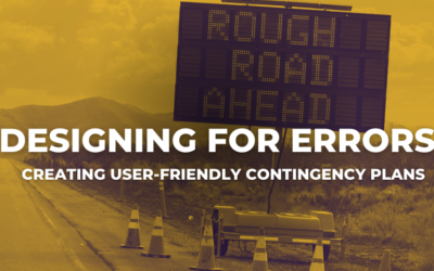
Defining Principles to Drive Design Decisions
There’s a standing joke here at Salesforce… Whenever someone in the product organization presents a list — and it could be a list of anything: features, research strategies, Dreamforce t-shirt colors, really anything — someone will always ask,: “Is that list in priority order?”
Use Cases For CSS Vertical Media Queries
We all love media queries, don’t we? Without them our layouts won’t be responsive. Media queries that check for min-width and max-width are well-known and used a lot. In this article we will explore different use cases for using vertical media queries in CSS. So we will focus on min-height and max-height.
What’s Wrong with Open-Data Sites–and How We Can Fix Them
Vast amounts of useful information can be found on government Web sites, but it’s often impossible to make sense of it
The Inside Story of Uber’s Radical Rebranding
TODAY, MILLIONS OF people around the world will turn on their smartphones and scan their screens for the black-and-white Uber icon, only to find it missing. Instead, they’ll see a colorful geometric shape—hexagonal if they drive, circular if they’re a rider—surrounding a small, bit-like square. The colors and patterns will vary from country to country—red […]
Why is Vertical Rhythm an Important Typography Practice?
Why is Vertical Rhythm an Important Typography Practice? You probably heard of the term Vertical Rhythm if you researched a little about typography on the web. It’s one of the most important practices when working with typography.
Devices all the way up: Notes on responsive design
Designing sites that adapt, in some form, to a users device is not a new thing – Wikipedia lists Audi.com‘s 2001 redesign as the first major instance of such a site. By contrast, the processes, work flows and tools to cope with the demands of designing for an infinite number of […]
“Learn More” Links: You Can Do Better
The phrase ‘Learn More’ is increasingly used as a crutch for link labels. But the text has poor information scent and is bad for accessibility. With a little effort, transform this filler copy into descriptive labels that help users confidently predict what the next page will be.
Easy Landing Pages in WordPress with Long Form Storybuilder
What do you do if you’re not a web developer and you don’t have a thousand bucks to hire one. But you want a custom landing page that looks great and is aimed to convert your leads into the sales?
rucksack
A little bag of CSS superpowers
If you want to add something to next week’s Radar – submit it here.
Here’s the link to this week’s batch of goodness: Radar #144.

0 Comments