
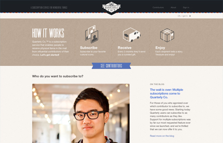
Beautifully done responsive design for Quarterly Co’s website. I love the crisp icon work and the background stripe using what looks similar to mail/package/wrapping fits well and makes me thing of getting goodies in the mail. Love the crispness to the design and also really like the smaller screen size design. Well done.




0 Comments