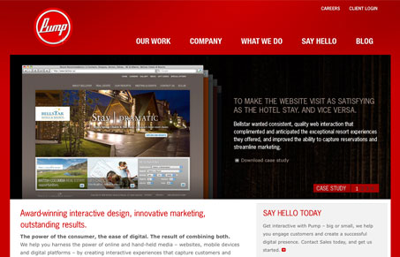
I really like the loud red color used on this design. The Pump logo is fun and nice looking which really goes well with the red too. I like the big case study images on the home page, I like the fact that you get hit with it right away. I wonder how much the site begins to compete with the work samples themselves with the really vibrant red color, meaning what do people take away from this site memory wise, that it was red or that they have really great work, something to really consider when using a stand out color as your main vehicle on a design.
Glassmorphism: The Transparent Design Trend That Refuses to Fade
Glassmorphism brings transparency, depth, and light back into modern UI. Learn how this “frosted glass” design trend enhances hierarchy, focus, and atmosphere, plus how to implement it in CSS responsibly.


0 Comments