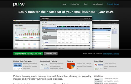
The team at Clear Function have release an update to Pulse, the app itself is marvelous, it’s a great example of a really beautiful interface for a web app. I mean what I said.
But I just want to talk about the web site, the part of the app that a potential user first lands on. The design gives me three huge screen shots of the app to look at quickly and then starts breaking down into the features and selling points of the app. I really like the “feature tour” page, that’s just a nice simple way to showcase all the stuff the app does, the “pricing and signup” page is also very simple and cleanly presented. They highlight their recommendation on which plan you should get then spend a little extra time with some FAQs just below that.
This site gives me just enough info to make the sale and doesn’t bog me down with too much extra info. It’s simple, easy to scan and looks really nice.


0 Comments