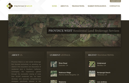
Submitted by Dave Snowden, Designer.
Tried to make this site clean and simple and easy to use for banker types but trying to give it some style at the same time so its not so sterile.
This is a nice, well-laid out site. I like the background details, and the way the image overlaps the brown and white adds just enough visual interest to keep the eye moving down the page. The hover navigation is nice effect, and it looks nice, but I do wonder if it’s a little too much. The depth implied by the drop shadow makes it seem like it jumps a bit. It’s also a bit weird when such a prominent effect is only on a couple of the main links. The typography is mostly well handled except for the justified text. This might be something that looks ok in print, but it’s just something that makes unnatural and hard to read. I think it would also be better if all of the text was set in Georgia.
The lightbox effect on the ‘Current Listings’ section is integrated well, but the fact that the images contain a lot of data and information make me think it would be better handled on a separate page.


0 Comments