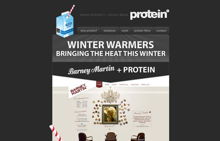
I really like the rich graphic feeling in the header area of this email newsletter.Then the larger graphics/screen shots that show off the work in the body drive home the quality of the work this firm can do. Having little pieces slide out the top and side of the newsletter also lends some strong visual focus like in the carton in the header and barber pole along the side. Good stuff.


0 Comments