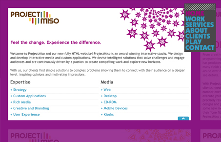
Project Miso is this year’s SXSW CSS Award Winner. You can check out other winners here.
I’m sort of split on this design, it’s cool, but really reminds me a lot of flash sites from a couple years ago. Is it just me? How do you feel about this?

Project Miso is this year’s SXSW CSS Award Winner. You can check out other winners here.
I’m sort of split on this design, it’s cool, but really reminds me a lot of flash sites from a couple years ago. Is it just me? How do you feel about this?

Project Miso is this year’s SXSW CSS Award Winner. You can check out other winners here.
I’m sort of split on this design, it’s cool, but really reminds me a lot of flash sites from a couple years ago. Is it just me? How do you feel about this?
Glassmorphism brings transparency, depth, and light back into modern UI. Learn how this “frosted glass” design trend enhances hierarchy, focus, and atmosphere, plus how to implement it in CSS responsibly.
Brutalism in web design rejects perfection for authenticity. Stark grids, raw type, and honest structure create interfaces that feel human, intentional, and impossible to ignore. Break the rules, on purpose.
Monochrome Minimalism merges Bauhaus discipline with IKEA simplicity. Clean grids, muted tones, and functional beauty create digital calm, proof that restraint, not decoration, defines timeless design.
I feel the “viewport” panning style navigation is a huge detriment to the design and a technical gimmick. Also, the transitions seem to be jerky… certainly not as smooth as you’d hope if they were relied on so heavily for the user’s experience.
Is there something I’m missing which makes this worthy of an award?
Gimmick. It’s one thing to push the boundaries of web technologies. But to do so in a manner that results in poor usability is just careless in my opinion.
I’m not sure either, the one thing that keeps sticking with me is the notion that somehow CSS makes all the stuff on this site cool… Last time I checked you needed javascript to move stuff around on a page like this.
Any time it takes me 30 seconds just to figure out how a site “works,” I consider that to be not a good thing. But maybe I’m just slow…
I thought the days were numbered for these type of sites, the only purpose this site serves is to showcase the clever css/javascript. The actual design and typography on the panels is average at best and could have been improved. Also a big problem for me is the usability issues raised from the small scrollbars for the content, I think Gene has it right – what is the point in trying to replicate a style which is much better delivered via Flash. Can’t believe this was the best entry to win an award.
From a user who knows little about javascript or css, I find this site incredibly frustrating. My experience is just…uncomfortable. I’m unimpressed with the colors and the design itself. And I’m totally frustrated and annoyed with menu and with the ability to see other pages while I’m on one page. I just can’t decide how to navigate through the site! Using the menu navigation makes me feel like I’m not being cutting-edge enough. And, of course, since it runs away and hides from me after a few seconds, I don’t feel I can depend on it to get me through the site. Relying solely on clicking on the other pages (and not using the menu at all) leaves me feeling trapped once I get to the Contact page—I can’t get anywhere else! Alas, I feel this site exists only to drive users crazy, and it has worked.
I quite like the style of it in a way. I think its just because it is a bit different and feels quite playful. Having said, it does have a bit of an old Flash feel to it.
There are some major problems though.
Takes ages to load.
Takes a bit of thought about how to navigate it.
My biggest gripe though is the layout breaking when the text size is increased. It annoys me when sites win prizes or end up on galleries when you can’t do this. Its almost like an unfair advantage when others design their sites to include such features.