Submitted by Darren Hoyt, @darrenhoyt. Designer & Developer.
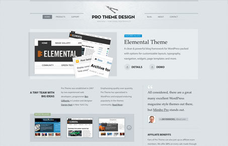
For this redesign, we wanted to avoid the shiny, heavily commercial appearance of most other online marketplaces. To make the product samples really stand out, we kept things muted. We also stuck to more traditional forms of design, hinting at handcrafted and architectural images like protractors, paper, graph lines, and so on. The overall message is to be perceived as reliable, serious and meticulous.
I love this simplistic down to business design. It has some of the trappings of recent wordpress theme design type stuff, like the javascript carousel stuff, but it’s really a very nice looking design. Good subtle colors, great typography & spacing between the elements really gives it a balanced look. I think tighter adherence to a noticeable grid would really make this design great, but I love grids and like to see them really stand out in a design.


0 Comments