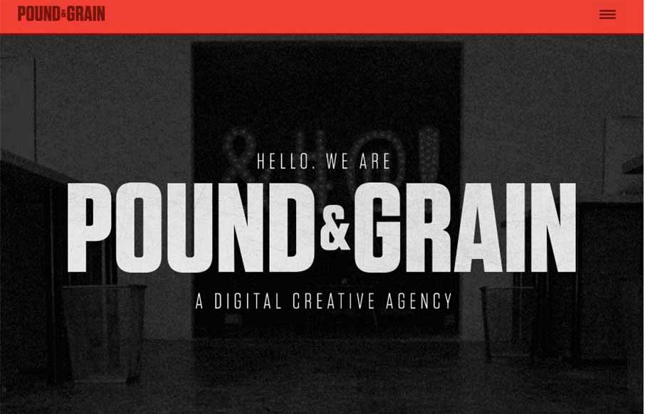
I really like the movement of the Pound & Grain site, out of Toronto. The subtle use of parallax with background shapes and colors, coupled with the images and copy make for a great experience. Also like the little vibrance of the animated gifs hero images, that smartly change to non-animated as you move to smaller screen widths. Content-wise, I also like their Story and Manifesto pages – I like stories that explain a company’s way of thinking, or the genesis of their ideas.


Glassmorphism: The Transparent Design Trend That Refuses to Fade
Glassmorphism brings transparency, depth, and light back into modern UI. Learn how this “frosted glass” design trend enhances hierarchy, focus, and atmosphere, plus how to implement it in CSS responsibly.


0 Comments