posterous.com

posterous

I like the new(ish) posterous.com website. I think I feel a big review type post coming on in regards to the Posterous home page history… maybe one day here soon.

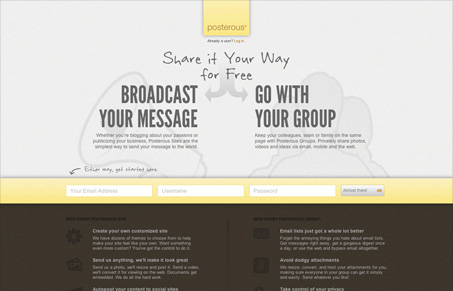
I really like the three signup form fields all lined horizontally. It makes it feel like a fast form even before you’ve filled it out. I also like the microcopy in the submit button “almost there” tells the story of where you are in the process, even if it’s a little ambiguous. The little login slide out form is also kind of neat the way it’s worked into/under the logo, clever. All in all it’s a good looking page with some clever design decisions to make it engaging.

0 Comments

Submit a Comment

Your email address will not be published. Required fields are marked *

News & Articles

Looking Fast: The Art of Website Speed Perception

Looking Fast: The Art of Website Speed Perception

In the web world, technical speed and user perception matter. By improving design for a faster appearance, you boost conversions and stand out online. Speed isn’t just loading time; it’s perception.

Designing for Errors: Creating User-Friendly Contingency Plans

Designing for Errors: Creating User-Friendly Contingency Plans

Contingency Design hinges on empathy, understanding user frustration, and transforming errors into positive impressions. By embracing these principles, you enhance user experiences, retain customers, and boost revenue in the competitive digital landscap