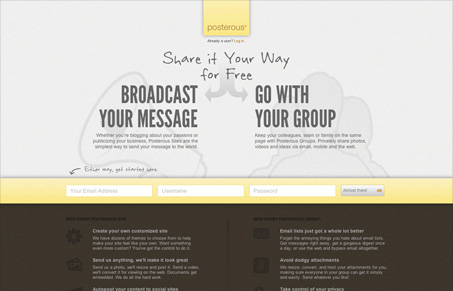
I like the new(ish) posterous.com website. I think I feel a big review type post coming on in regards to the Posterous home page history… maybe one day here soon.
I really like the three signup form fields all lined horizontally. It makes it feel like a fast form even before you’ve filled it out. I also like the microcopy in the submit button “almost there” tells the story of where you are in the process, even if it’s a little ambiguous. The little login slide out form is also kind of neat the way it’s worked into/under the logo, clever. All in all it’s a good looking page with some clever design decisions to make it engaging.


0 Comments