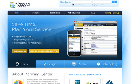
I think this website is pretty complete with everything a good product site needs. I kind of like the way the main section on the home page does the carousel effect, it’s pretty easy to understand and I like the tab-like layout. The colors are nice and subtle and most of the design just gets out of your way and let’s you consume the information. I do think the calls-to-action are confusing, take a tour and sign up are given the same weight visually and then there is a giant button that has text-links in it that are equally split evenly. I’d really like to see the effectiveness of that large button being split like that, I could see it going either way really.
Looking Fast: The Art of Website Speed Perception
In the web world, technical speed and user perception matter. By improving design for a faster appearance, you boost conversions and stand out online. Speed isn’t just loading time; it’s perception.


0 Comments