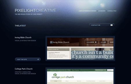
This is a great designer portfolio design. Love the background color “explosion” and the layout of the work samples.

This is a great designer portfolio design. Love the background color “explosion” and the layout of the work samples.


Large, close targets are faster to hit than small, distant ones, that’s Fitts’s Law. A look at the 1954 rule behind buttons, prime and magic pixels, thumb zones, and dark patterns.

Your working memory holds about four things, not seven. Chunking groups loose information into meaningful units that slip past that limit, the psychology behind phone numbers, scannable pages, multi-step forms, and grouped navigation.

The Call to Action hasn’t changed in a decade, but the bar has. A fresh look at prominence, copy, mobile tap targets, and accessibility, with lessons from three major design systems.
Too bad it’s not
It kind of looks like a rip of Drew Wilson’s site. The style of the lighting is a judgment call but the font is definitely the same:
http://www.drewwilson.com
That’s really picky, it’s similar, but I would in no way say it’s a “rip”…