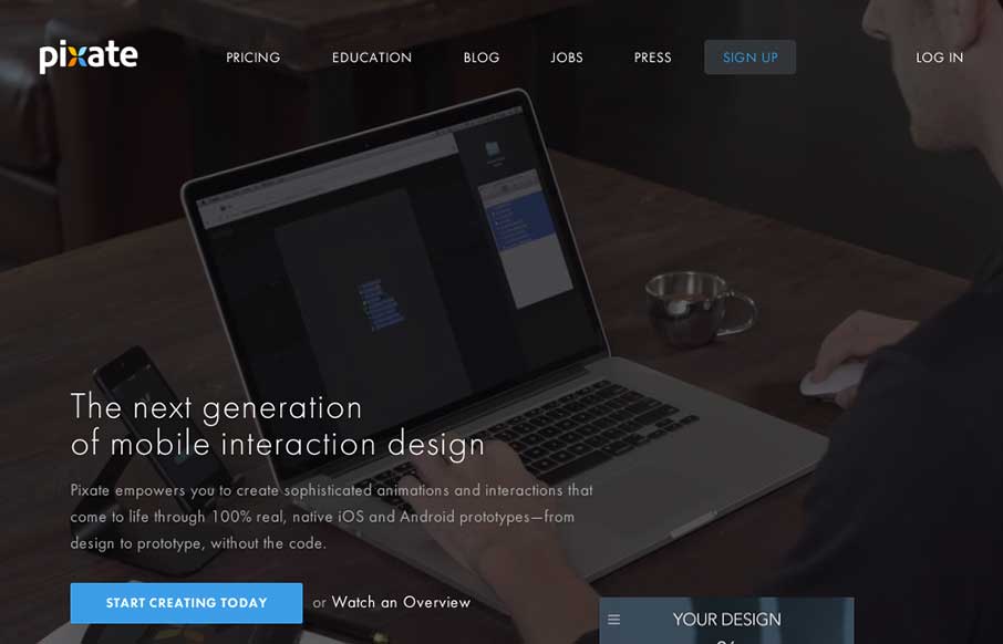
As you may have guessed by now, we see a ton of websites – good, bad, spam (ugly). We also have seen every “app product page”, that most have never deviated from the structure of the Square Reader product page from 3 years ago…
Pixate could have gone there – and almost looked like they might at first – but then in the middle of the page, you find something cool and unique: a product demo. If you’re reading me right, I’m not being ironic this time. Really.
You see – the app is for mobile interaction design – looks like a drag-n-drop to help design native app prototypes. After working with a bunch a start-ups, and helping them with UI / UX work for their apps – well developers, I love you and appreciate your business, but maybe Pixate has something that you should look at. Start with the semi-interactive demo on the site – move to the full monty if you like the idea of it.
The site itself is slick and well thought out – if Pixate catches on – we can just do more UX consulting, and less UI work (fine by us!)


0 Comments