
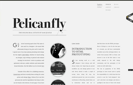
Nice type heavy design. I like the simple nature of the black type on the light colored background and the typography is rather delicate looking but the grid is very rigid. The responsive treatment of the design is well done as well, it really flows great with the overall look and feel to have it change around like this.




0 Comments