pbs.org

pbsorg

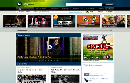
This is the new layout for the PBS.org website, there are a lot of design details that really work here. There are also some that don’t work so well for me, like the big sliding image gallery near the header. It’s confusing as to the context of the images and you don’t know what type of story you’re about to get, video or text only, it’s a surprise. Overall the design is clean and orderly and has the trappings of all major network/news websites. It shines in some areas, like the home page layout of stories down the page, I like the way it’s displayed here. The large drop downs are also nicely used as well.

0 Comments

Submit a Comment

Your email address will not be published. Required fields are marked *

News & Articles

Looking Fast: The Art of Website Speed Perception

Looking Fast: The Art of Website Speed Perception

In the web world, technical speed and user perception matter. By improving design for a faster appearance, you boost conversions and stand out online. Speed isn’t just loading time; it’s perception.

Designing for Errors: Creating User-Friendly Contingency Plans

Designing for Errors: Creating User-Friendly Contingency Plans

Contingency Design hinges on empathy, understanding user frustration, and transforming errors into positive impressions. By embracing these principles, you enhance user experiences, retain customers, and boost revenue in the competitive digital landscap