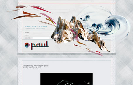
Paulleedesign.com has beautiful artwork. The layout is a simple, one column tower with muted color and texture. This is pretty ideal for displaying the artwork, which is pretty stunning. Thats pretty much all there is to the site: a beautiful header, a simple vertical nav and gobs of sweet, sweet eye candy.


0 Comments