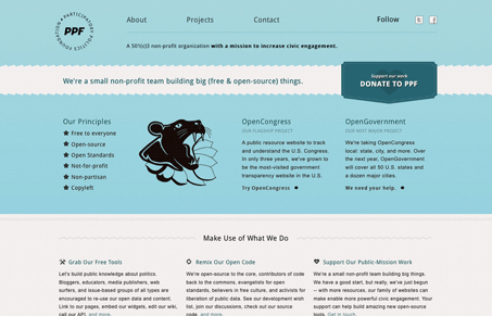
Nice simple clean looking design/layout for this website. I like the light blue color and using droid sans is kind of neat here. I particularly like the “Donate” call to action button/graphic.
Nice simple clean looking design/layout for this website. I like the light blue color and using droid sans is kind of neat here. I particularly like the “Donate” call to action button/graphic.

In the web world, technical speed and user perception matter. By improving design for a faster appearance, you boost conversions and stand out online. Speed isn’t just loading time; it’s perception.

Contingency Design hinges on empathy, understanding user frustration, and transforming errors into positive impressions. By embracing these principles, you enhance user experiences, retain customers, and boost revenue in the competitive digital landscap

Explore the advantages and considerations of fixed navigation design in web development. Enhance user experience and aesthetics while ensuring it serves a purpose in your design.
I’m really starting to love the CSS3 “Text-shadow” feature and what it does to text. For this example, the text-shadow is 1px, and is super subtle, so subtle in fact that it’s barely noticeable, yet the over all effect transforms the design. It provides that extra layer of depth and nuance that makes this site really pleasing.
The only issue I have with this site, is the interior page copy. The width I feel, needs to be brought in a bit for increased readability.
I agree that the measure ie copy-width could be narrower. One pet peeve that I have is text links that aren’t immediately distinguishable from regular text and vice versa. That’s the case with the masthead of the home page. Also, I honestly didn’t notice the Donate link until I read about it in the description. The graphic should be pink or some other color that more sharply contrasts with the light teal of the masthead.