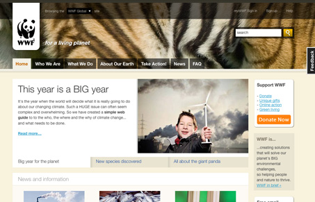
Really neat looking website, there’s a ton of information here and it’s really hard to design a website that remains interesting and not become just a big page of links. It does take a few minutes to really figure out what this website is really all about, I see the logo but I also know that WWF has it’s own other website at wwf.org.
The main background in the header is kind of misleading, I get that it’s a tiger, but it makes me think the site is more about animal preservation than anything else, and also leads me to think they have something going on specific to tigers at the moment, which they do not appear to.
As you move down the page, it does devolve into many links and sections of links, they do seem grouped intelligently and it’s quite gracefully done. Also as you move through the website, a lot of the content area’s typography goes haywire, likely a result of whatever content management system the site uses, but it’s distracting.
All in all it’s a huge site, that’s been handled well, it’s engaging to say the least and certainly worthy of a thorough look through.


0 Comments