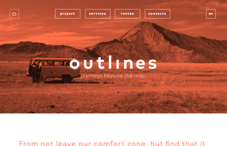
Pretty cool use of the main image and the simplified navigation layout. I really like the visual interest in the layout as you scroll down the page. It generally keeps you eyes pulling down to get to more content.
Looking Fast: The Art of Website Speed Perception
In the web world, technical speed and user perception matter. By improving design for a faster appearance, you boost conversions and stand out online. Speed isn’t just loading time; it’s perception.


Another nice site that is happy to keep it simple. Less is more and the description above nails it: it does that while keeping your eyes moving down the page and discovering more content.