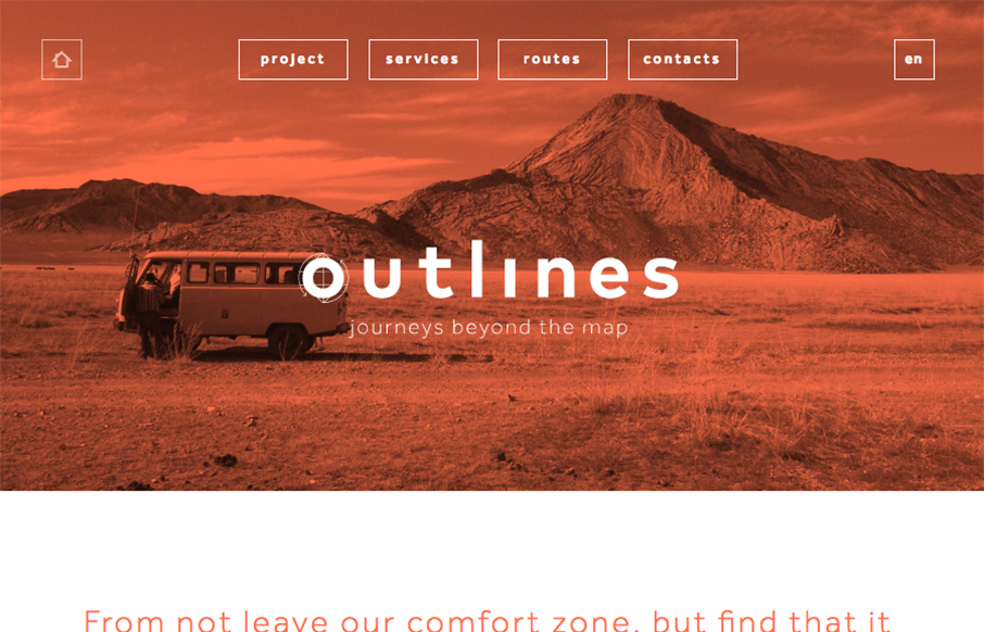
Pretty cool use of the main image and the simplified navigation layout. I really like the visual interest in the layout as you scroll down the page. It generally keeps you eyes pulling down to get to more content.


The Call to Action, Revisited
The Call to Action hasn’t changed in a decade, but the bar has. A fresh look at prominence, copy, mobile tap targets, and accessibility, with lessons from three major design systems.


Another nice site that is happy to keep it simple. Less is more and the description above nails it: it does that while keeping your eyes moving down the page and discovering more content.