
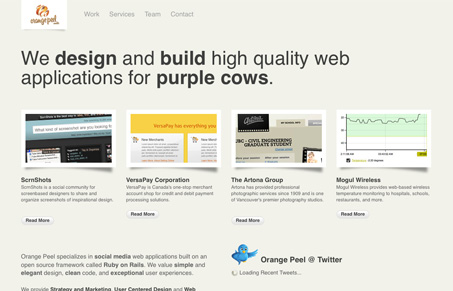
I like the clean grid based layout that gives this site a nice open feeling. I find that the sub pages particularly the work page, falls a little flat, i’d like to see more variation on the design here, just something that breaks the monotony of the rest of the site would be fantastic. The logo is really awesome, and I know it’s blasphemy but “could you make it a little bigger”, show it off! I like the Seth Godin reference in the tag-line too, I wonder if that creates any discussion between this company and their clients ever? The “who are we” tab that pulls down the giant list of who they are sentences has a nice visual impact too, i’m all for little Easter-egg like surprises like this, so long as they aren’t full of really necessary content.


Fitts’s Law: Why the Easy Button Wins
Large, close targets are faster to hit than small, distant ones, that’s Fitts’s Law. A look at the 1954 rule behind buttons, prime and magic pixels, thumb zones, and dark patterns.


As you said it is a nice lay out. The subpages seems to be a bit flat. If they improve then it will really be a nice one.