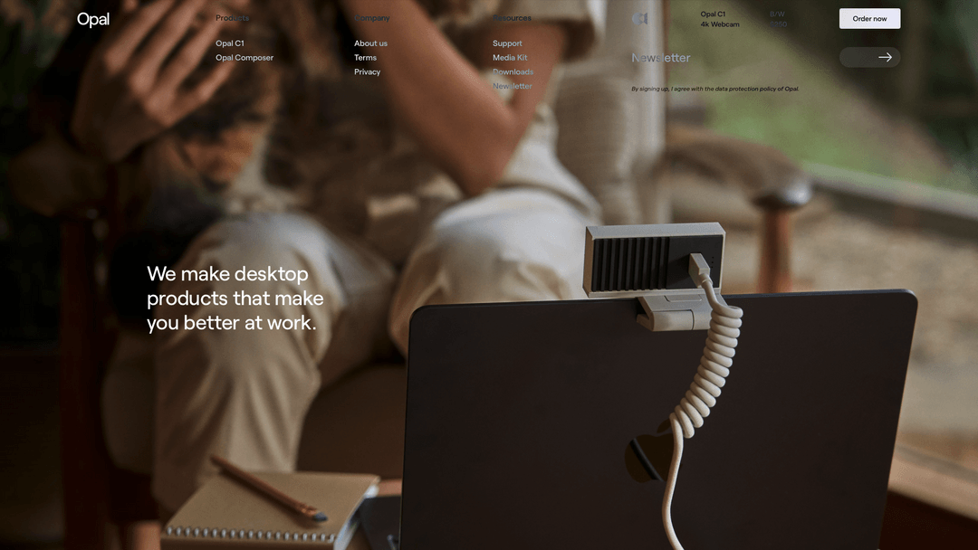
Very nice use of large imagery to tell a story. You immediately know what they’re about just by the image alone. I like the main nav and how it shows the sub-options but when you scroll they go away. Nice. Not wild about the gray on top of the image but it still works well enough.


Glassmorphism: The Transparent Design Trend That Refuses to Fade
Glassmorphism brings transparency, depth, and light back into modern UI. Learn how this “frosted glass” design trend enhances hierarchy, focus, and atmosphere, plus how to implement it in CSS responsibly.


0 Comments