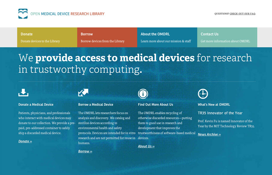
Love the omdrl.org website, it’s a beautifully minimal example of solid design. The typography and hierarchy of most everything across the site is in order. Particularly interesting is to study the three different phases of the main navigation design for the major screen width targets. We discuss this in depth in the screen cast review.
Sorry about the flickering resize of the browser in that video, screencast software went nuts on me.
Also from Maria:
This site has a simple, clean look to it where the layout adheres nicely to a structured grid. Nice touch with it being responsive, though it presents a lot of scrolling especially to get to the form on the Borrow page. Some sort of jump link near the top could work. Aside from that, I think the iconography and type are suited and overall the site looks nice.


0 Comments