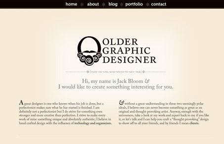
This is a strange site. First of all, the name. After reading the intro I still had no clue, I thought that perhaps this person’s name was ‘Older’, but it wasn’t. After reading the about ‘page’, turns out it’s a bit of a joke (I think), a title that Jack has bestowed upon himself. I’m all for tongue in cheek and jokey copy but it can’t come at the expense of professionalism or of clarity. Confusion is not the first thing you want to greet a user with.
As far as the look goes, it has a a pleasing type dominated design and I like the overall look, but some of the elements need a bit of space, and the line-height of the text needs some more attention paid to it for it to create a rhythm where the text flows from one area to the next. Also, I think it would be more effective if the typeface was just Georgia, and not Museo plus Georgia. The Museo, in this context, just doesn’t really jive with Georgia, perhaps it’s just that the sizes are all over the place.
The functionality, in that it’s a one page site with anchors and some javascript scrolling, is nothing new but I’m confused why there are these… let’s call them interstitial, bits of text that just whizz by. What’s the point?
Submitted by Jack Bloom, Designer & Developer.


The site has expired, and is no longer there