
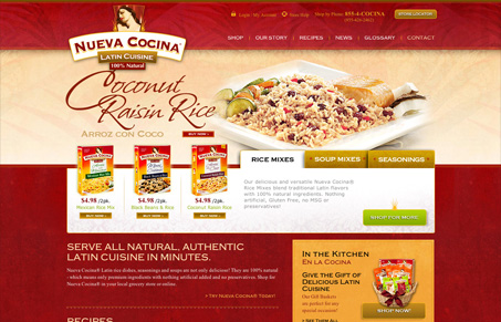
I like nuevacocina.com’s bold use of color. The richness of their red is strong and emotive. The photography is great and is seamlessly integrated into the visual language of the design. I think that the liberal use of text images for buttons and such is unfortunate but nuevacocina.com is a well branded engaging site.




0 Comments