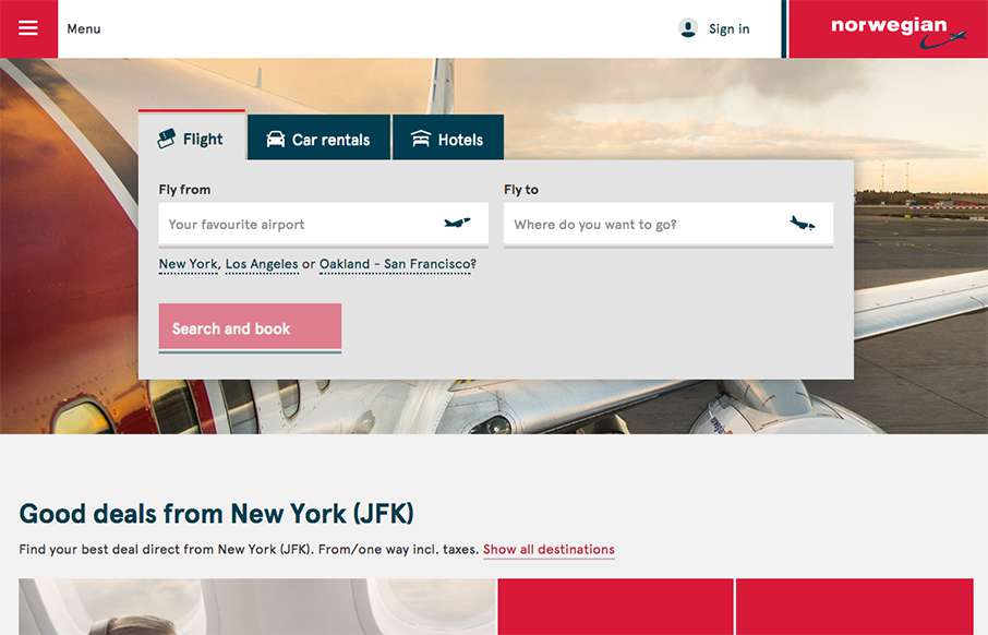
Our opinion of restaurant sites is usually like our opinion of airline sites – they generally stink. That’s why it’s refreshing to see Norwegian Airlines’ site. It’s clean, and simple, and functional. They’ve taken a lot of the business out of the home page, and put it in the hamburger drawer menu, so you can concentrate on the thing you need to really do – find a flight – nice.
Looking Fast: The Art of Website Speed Perception
In the web world, technical speed and user perception matter. By improving design for a faster appearance, you boost conversions and stand out online. Speed isn’t just loading time; it’s perception.


0 Comments