
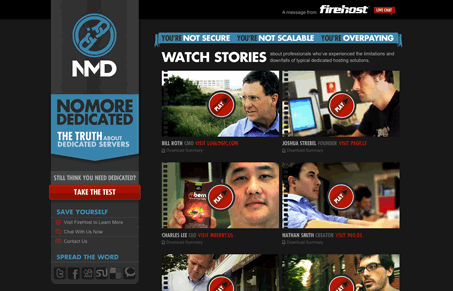
Nice clean and well done “micro-site” (For the record, hate that term). Visually it’s very tight, the graphic elements are all sharp and well done, even the videos are super slick. Watch our screen cast of the site for a more complete review. It’s all but a single page design with the “test” being the second page, which is a fun addition to the experience. In general, this is a nice lesson in a small(ish) marketing support site.




0 Comments