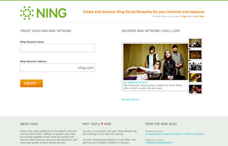
The new(ish) design for the ning website/homepage is a really nice rework. I love the simplification of everything, sign me up is the first real option here with previews of networks right next to it using big bold pictures. I do like how they are handling the sign up form elements, plenty big and the network name has the format they want you to use already inline for you so you know what you’re doing. The discover page is pretty interesting, the way it lets you select and drill down using the links in a big circle like that. It works pretty well. Overall nothing earth shattering here design wise, I just think it’s a simple design that does a good job that could have easily been overwhelming.
Looking Fast: The Art of Website Speed Perception
In the web world, technical speed and user perception matter. By improving design for a faster appearance, you boost conversions and stand out online. Speed isn’t just loading time; it’s perception.


0 Comments