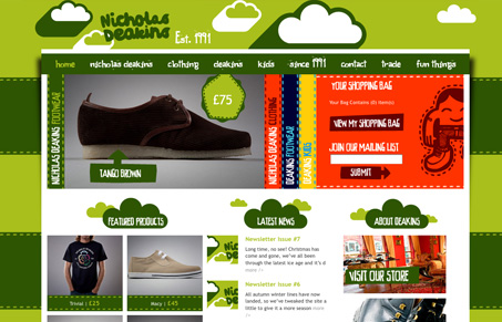
At first glance this site is a little overwhelming, but fun with all of the colors and graphics grabbing my attention. It’s also a little confusing at first that there are two nav links named “Nicholas Deakins” and then “Deakins” but I do like the about page “Since 1991” because it’s different. I did find the footer to be helpful because it was so well organized.
It’s okay that they are pulling in their newsletter for the news feed but maybe they should consider giving it a more interesting title than “Newsletter Issue #3”.
My last comment on this site is that they don’t give much of a description on their items in the gallery. A customer might want to know more details about the materials the clothing/footwear are made of.


0 Comments