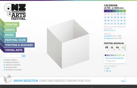
Really neat website. This thing is so full of content and interactive functionality it’s kind of misleading. The design at first glance makes it look like there isn’t quite as much here as there really is. Julia and dig into some details in our screen-cast review of it. But overall we liked it. We were both amazed at the quality of the information architecture and overall visual organization. There are some things we found a bit over the top, like the home page animation and the “show selector”, not that those are bad in any way, just that given the sheer amount of info here they could potentially be interference to the content below.
I love the navigation design. I love the detail in that when you mouse over one of the links all the others go gray. Very cool and being someone who’s into the details like that, it was such a nice surprise to see that. I’m not sure i’ve ever really seen that sort of thing either.
Great site!


0 Comments