Neutron Creative

http://www.neutroncreative.com/

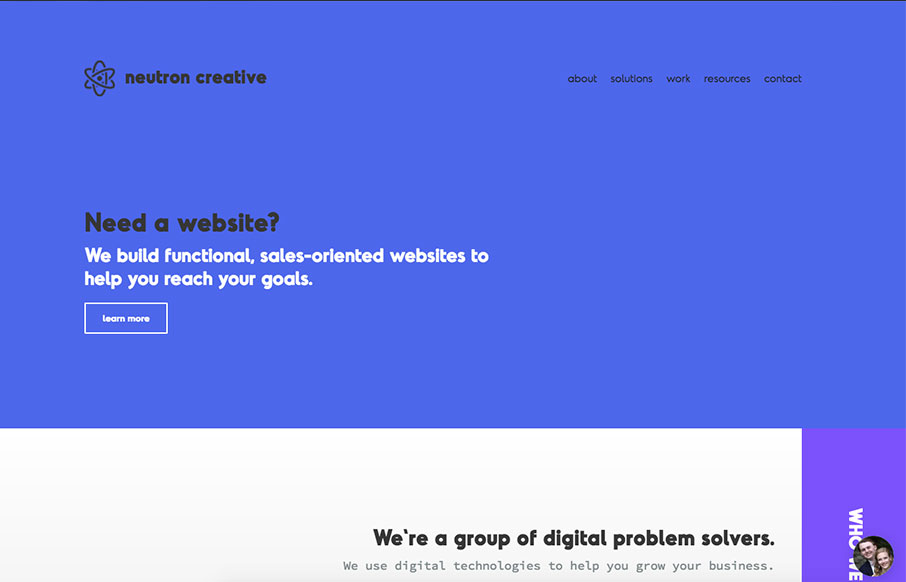
I like showing off the code snippets as you would normally show off visual work. Pretty nifty idea. I also like the off center vibe of the sections. Solid layout.

I wanted to build a site that really showcased all of the new aspects of our rebranding, including our dynamic brand color (we don’t have one company color). I figured at the very least, it’s certainly different 🙂

Submitted by: Jimmy Bisenius
Twitter: @neutroncreative
Role: Designer & Developer
Country: United States

0 Comments

Submit a Comment

Your email address will not be published. Required fields are marked *

News & Articles

Sign-Up: Enhancing Conversions through good UX

Sign-Up: Enhancing Conversions through good UX

Optimize your website’s sign-up process by focusing on clarity, ease, and user mindset. Clearly explain the purpose, benefits, and steps, and use social proof to build trust and drive conversions.

The Essential Guide to Getting Started on Freelance Writing

The Essential Guide to Getting Started on Freelance Writing

Explore the lucrative and fulfilling world of freelance writing with our essential guide. Learn about specialties like blogging, social media, article, and technical writing. Build a portfolio, find work, set up your business, and discover the potential earnings. Embrace the freedom of working from home and follow tips for success in your dream career.