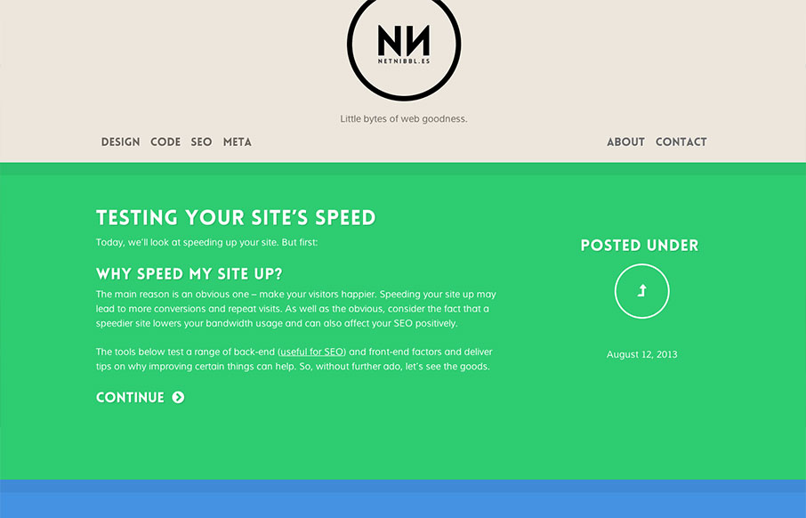
netnibbl.es takes simplicity to heart. The site is dead simple in layout, design and detailing, but the effect is sophisticated none-the-less. While differentiating post categories via color has it’s usability issues, netnibbl.es does a good job of adding an additional hint with the ‘posted under’ graphic. Also, fields of intense color can be overwhelming, but netnibbl.es has found a palette that certainly leaves an impression without being problematic. Really nice.


The Call to Action, Revisited
The Call to Action hasn’t changed in a decade, but the bar has. A fresh look at prominence, copy, mobile tap targets, and accessibility, with lessons from three major design systems.


0 Comments