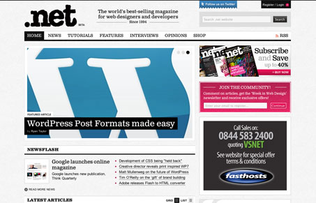
The new design for .net magazine is quite nice. I like the clean black and white grid based look for the layout, there’s plenty of color in the photos and ads that adding it in other places would likely overwhelm you. The page scans pretty well even though there is a ton of content displayed at one time. There is some subtle stuff going on with the design as well as some pretty straight forward bolder items. Overall it’s a great site, what really makes it great though is the content, which is super rich.


0 Comments