
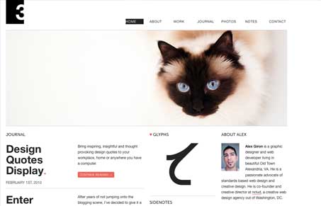
I like the big image followed below by the nice grid layout, very nice. I also like the hierarchy in type sizes going from left to right. The Twitter pie chart is also smart looking. There’s lots of little ideas and gems of layout throughout this website, dig in and take a looksee.




0 Comments