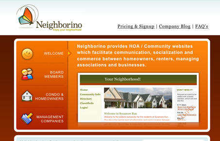
Vibrant colors, good icons and clean copy make this website really work for me. I like the main block and how it takes you on a quick tour of what the product can do. It’s a conceptual hurtle for people to know everything the product can do and that’s often pretty hard to present without making the website overly complicated. The signup form is fairly clean, even though it feels a bit long, it could just be that the field labels are set to the right of the fields, this can have a slowing effect as you make your way through the form. I think in this case that’s a good thing.
Glassmorphism: The Transparent Design Trend That Refuses to Fade
Glassmorphism brings transparency, depth, and light back into modern UI. Learn how this “frosted glass” design trend enhances hierarchy, focus, and atmosphere, plus how to implement it in CSS responsibly.


Gene,
Thanks so much for the kind feedback! We hope that our brand can really change the way people view neighborhood sites. It’s a true honor to be recognized by Unmatched Style!
Take care,
Eric Prugh
Co-founder, Neighborino