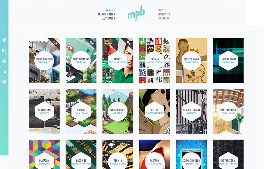
Nice simple display of the artist’s work with a clean grid and minimal color palette. But it’s the little details, the RWD and the interactions on the title shapes that complete the design and make it feel so finished and polished. Great work here.
Submitted by: Tim Smith @mypoorbrain
Role: Designer
Portfolio of graphic designer and illustrator Tim Smith. Brain powered graphics fun.


0 Comments