
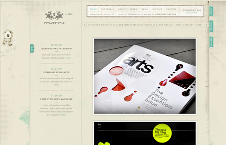
This is one of the most finely detailed and well illustrated website designs i’ve seen in a long time. I thoroughly enjoyed clicking through all the various pages and nooks of this site. Though the font of the body content is a little small, it does leave a nice textured feeling to those areas. It’s coded pretty well and the main navigation is nice little sprite usage. It’s surprisingly simple in it’s design, letting the illustrations and textures do most of the work to make this look so great.


Fitts’s Law: Why the Easy Button Wins
Large, close targets are faster to hit than small, distant ones, that’s Fitts’s Law. A look at the 1954 rule behind buttons, prime and magic pixels, thumb zones, and dark patterns.


0 Comments