
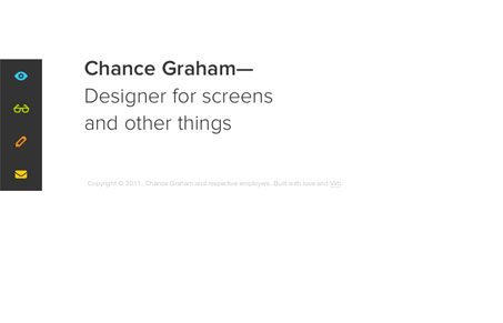
Chance’s site may be composed of only a few elements, but they are placed so perfectly it’s clear that every space, color, font, and word was chosen with intent. Such a simple site can be deceiving in that it might seem easy to create. After all, it’s just a few links and a few words. But it takes a mature designer with a good eye for spacing and attention to detail to really make it seem natural and obvious. Once you start going through his portfolio, you see an array of really great work. This is exactly what I think the best portfolio sites should be. Just show me nice big images of a ton of impressive work.




I love minimalism when it’s done as well as this design. Looks like he’s now with the web design team at Apple. Super cool stuff! Check his dribbble shot on the move.
Thanks for the kind words! Way too nice.