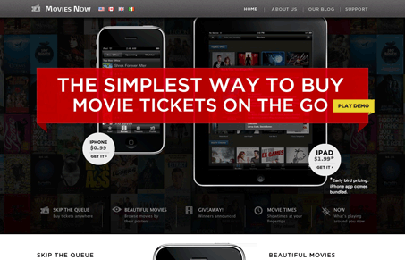
Really nice looking iPhone/iPad app website. I love the big red banner and white type. I also really like how it looks as you scroll down the page, the visual rhythm is nice and the stark difference between the black and white backgrounds works really well for the content here. I’d love to see the sub pages given a little more love, but they still deliver the content well. Overall I really do love this home page.


0 Comments