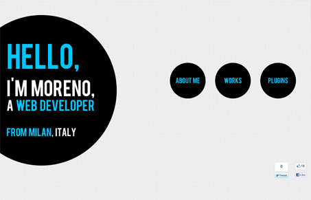
moretech.it

moretechit

Submitted by: Moreno @_moretech

Simple design given impact by adding some animation. I love how the large circles drop and bounce slightly on page load. Then the timing of the scroll/transition between sections is very good. It “feels” nice as you use it. It leaves me wanting more, like a blog or something, that’s a compliment.

0 Comments

Submit a Comment

Your email address will not be published. Required fields are marked *

News & Articles

The Essential Guide to Getting Started on Freelance Writing

The Essential Guide to Getting Started on Freelance Writing

Explore the lucrative and fulfilling world of freelance writing with our essential guide. Learn about specialties like blogging, social media, article, and technical writing. Build a portfolio, find work, set up your business, and discover the potential earnings. Embrace the freedom of working from home and follow tips for success in your dream career.