Submitted by: Jason O’Brien @zenworm
Role: Designer & Developer
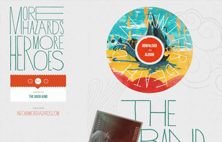
This is simply a beautiful website. I love the typography and overall vibe of this site. It’s only amplified for me with the responsive design approach and then the almost subtle vertical parallax. It’s just badass imho…


The way the ‘record’ starts spinning when you press play is a nice touch. It’s also very nice that there’s no Flash involved, but it’s still an effective and useful audio experience. It even works great on the iPhone. It’s interesting that on the iPhone, the ‘download’ link changes from a link to a zip to a link to the iTunes store, which is a good way to tailor the experience to the device. I’m not sure why they chose to hide all the lyrics and photos for smaller screens, though.
I didn’t catch the link change on the iPhone. Good catch man.