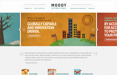
I’m really taken in by the fact that moodyinternationalllc.com is a site for an accounting and audit service. It’s tone and design are clearly intended to undermine the common perception of the accounting industry as stodgy and boxed in. A wide open and loosely structured design provides movement and energy while the extensive use of lush, textural artwork create an environment of warmth and trust. Small touches of animation in hover states help to support the direction that the art and structure have taken.
I will say that it took a moment for me to realize that I was looking at an accounting service site. The visuals are so great a departure from what I would expect from that industry that I didn’t know what I was looking at. I don’t think the name “Moody International” helps but thats another debate entirely. Still, the copy is crisp and enlightening if not action-oriented which helped me understand what I was looking at. Love the artwork and the subtle animations as well as a less structured design that works really well.


I love that the header is slightly transparent on the internal pages and you can see hints of the content as it scrolls up. That’s a fun little extra.
The illustration work on this site does it for me most of all. Beautiful work here!