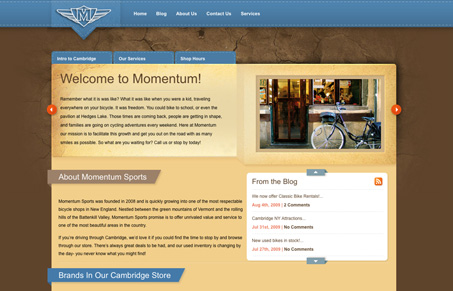
I like the header design, the main navigation treatment and the 3D looking details across the site. There’s some nice interaction with the scrolling marquee box and the blog up/down arrows. I don’t necessarily feel that the overall look goes with what you would expect to find on a bicycle shop, there’s a surprising lack of bike photos on this site. I do like the look and feel of the design it’s very nice and polished, it just doesn’t make me think “bike” necessarily, that just my opinion though.
Design by momentify.com
UPDATE:
It’s been noted to us that this design is actually a Theme: http://www.elegantthemes.com/preview/eBusiness/


Um, here’s the thing. This is just a theme from Elegantthemes.com called eBusiness (http://www.elegantthemes.com/preview/eBusiness/). They have a blue version. The only customization here is the logo. I really don’t think this should be featured here at all.
I think that design comes from Elegant Themes. The stitched menu bar and the fold-over tabs/header bars is quite typical of them.
Would explain why it doesn’t look like a site for mountain bikes.
Hmmm, it threw me because it’s in Momentify’s portfolio: http://momentify.com/portfolio/ — It was a submission too. Jeeze…
I won’t remove it but I’ll update the post to reflect the original theme.
Thanks for paying attention guys!