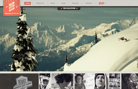
This website has some badass interactions. First of all though, the logo when you roll over it – crazy stuff – I love it. The slide down ski selection drawer is neat. Though the simple “The Collection” handle or button that slides it out is a bit understated. Not sure i’d want to hide something so very cool as much as that (though the “products” link the main nav activates it as well). The large image is cool and other smaller ones in the slideshows are cool as well. This site is kind of screaming to be responsive too, i’d love to see that.


0 Comments