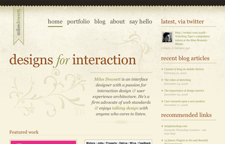
Nice minimal style design, but with nice flourishes and color. Interesting way to do the portfolio too, I like the little icon-like shots that load the larger details.
Glassmorphism: The Transparent Design Trend That Refuses to Fade
Glassmorphism brings transparency, depth, and light back into modern UI. Learn how this “frosted glass” design trend enhances hierarchy, focus, and atmosphere, plus how to implement it in CSS responsibly.


I never get tired of sites imitating paper (or any sort of natural texture). This particular background texture almost appears to be cement, though I believe the intent was parchment?
When executed this well, it’s a nice break from some of the sterile backgrounds and block-laden designs we encounter everywhere.
Great site, Miles.
I really like the site. Artistic, yet clean and easy to follow. Though I’m not old, I actually like the larger font size he uses in the main body area. Gives it even easier readability.
There’s an easiness to this site that’s hard to beat. It’s simple and clean, and that really works here. I just feel comfortable visiting the site; it makes me want to stick around.
Just one “sticky” moment for me. At first, I couldn’t find his work. I clicked on Portfolio and totally ignored the right side and read the copy on the left. I suppose I’ve been trained to tune out the right side because that’s where the ads are? I don’t know what happened! Eventually, I found the actual work and enjoyed the descriptions and presentation.
Nice site indeed.
Miles’ work is outstanding too when you dig into the portfolio.