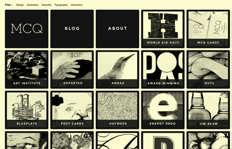
This is a pretty incredible gallery site. The extremely regular grid is a perfect structural backdrop to display his hand crafted art. The dynamic movement of the page is complex in nature but totally intuitive once you see it shift the blocks around once. The fluid width is a nice touch, as well as working perfectly with the shifting boxes theme. The creamy flat yellow and black color scheme works beautifully with the small achromatic thumbnails of his work, which are textural and varied. This site is a good example of design that doesn’t get in the way of content and still has a character of its own.
Often, highly designed and/or very dynamic gallery sites overwhelm the work. They subjugate the work they are supposed to be displaying into little more than filler between design elements. Conversely, sites that try to be a simple backdrop for their content can often come across as flat and devoid of their own character. Mike’s site rides the line between being charismatic and serviceable, beautifully capturing the quality of his art within the framework of a beautifully dynamic and intuitive interface.
Just as a side note: the illustrations are amazing.


wow. The description said it all. I loved the site’s palette, and the overall UX. You’re right, it does toe the line between being over designed.
Maybe over designed is the wrong phrase, but it it comes close to not achieving the goal of driving the user to the illustrations – which I feel should have been highlighted even more if that’s even possible. But now i’m just getting nit-picky.
The site has a big, bold character with a robust UI that compliments it nicely, and being a wanna-be illustrator myself I wish there were more sites like this. Well done.